When I was in kindergarten I drew a landscape picture with crayons. My mother took one look at it and knew something was wrong with me. I had drawn the sky purple and the grass brown and the tree green. Apparently that wasn’t quite reflective of the real world.
When I was about 12 I learned that my dream of being a fighter pilot wasn’t within my reach. I was, however, lucky enough to get to do that in October of 2008. I can’t make a career of it, but I can do other things that I love. One of those things is making games.
I don’t live a different life as a color blind person. It rarely effects my day-to-day living. Things that it does effect include: I occasionally lose red objects in the lawn and I stop at all non-green flashing signals at night to ensure my safety as the yellow flashers and the red flashers are very hard to tell apart with nothing to compare them against (such as position or walk signals). I give green Sour Patch Kids to my wife when she asks for red. Other than small things like that, I live a pretty normal life.
Games are a love of mine and I enjoy most types. Color vision deficiencies (I won’t bother posting statistics. You can view them yourself at the relevant Wikipedia page) affect a small enough percentage of the population that worrying about afflicted people playing your game seems like an easy thing to dismiss, much to our chagrin.
There are a multitude of games in the wild. I figure it’s safe to say that the majority of them were developed without giving a single moment’s thought to color blind gamers. If I weren’t color blind myself, I might also dismiss it as trifling and unimportant. However, I’m in the unique position of being a gamer that makes games and has an opinion. Okay, maybe I’m not so unique.
First I’d like to point out common problems: (Links are to Jay is Games reviews)
Stained Glass. Match the colored sides of tiles.
Twinoo. Perform math and color manipulations.
Loop. Draw circles around same colored butterflies.
The 3 games linked all have similar problems. They use colors that look nice to the developer, but they are too similar to a color blind person. I am unable to play any of those games without quickly running into issues with the colors chosen. On Loop I run into problems on the second level. It’s a game made for young children and I can’t play it because of the color choices.
Puzzle Bobble is another game that doesn’t get it right.

I believe there are 5 different colored bubbles visible in that screenshot. However, the orange, yellow and green are extremely hard for me to immediately tell apart. Since they are right next to each other, with some effort and time I can tell that the line of bubbles coming off of that red on the left screen are truly different. However, the game isn’t one that considers patience a virtue, and, to be an effective player, I have to make split second decisions. My split second decisions created that line.

In the top-left corner there’s a whole group of similarly colored bubbles that I just kept shooting there thinking that they’d end up popping. What makes this game even more difficult is the fact that the bubble I’m shooting starts with nothing around it to tell me what color it is. With some games that have similar colors right next to each other it’s possible to tell them apart by comparing one to its neighbor(s). This game has a large gap between target and projectile. By the time they’re close enough to do good comparisons the game is already lost. An easy fix is to make the objects have more differentiation without using new colors. Symbols or shapes, perhaps.
PopCap Games created an extremely fun game by the name of Peggle. (I’ve used Peggle Extreme, available for free on Steam, screenshots for this. I assume the other variants employ the same technique.) It’s a pachinko-style arcade game with cute graphics and wonderful gameplay. Orange pegs are the pegs to remove. Green pegs provide a special powerup and purple pegs are worth bonus points. Blue pegs are just filler and provide minimal points.
The developers at PopCap include a color blind mode that can be enabled from the menu. Enabling it removes the lighter highlight around the blue studs to make it easier to tell them apart from the purple studs. They also made the orange pegs a bit better looking and increased the resolution, oddly. The non-color blind oranges look a bit blurry when compared to their brethren. The best thing that PopCap did is introduce shapes to help tell the special pegs apart. The green pegs have triangles and the purple pegs have plus signs.
First, color blind mode off:

Next, color blind mode on:

The first time I played through Peggle I found myself getting frustrated because I was unable to tell the orange and green pegs apart easily. Again, it’s far easier to tell them apart when they’re close to each other, but separated I just couldn’t tell that the green pegs were there and assumed them to be orange. Big thumbs up to the person at PopCap responsible for this change. Thanks!
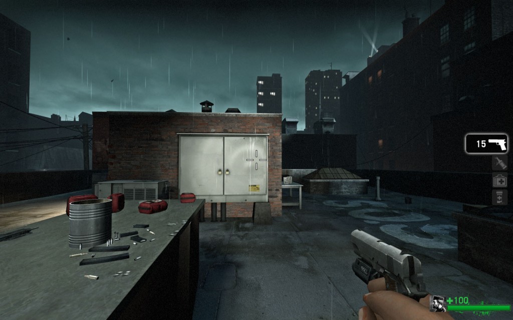
That brings us to another developer that got it right. Valve recently released their phenomenal zombie apocalypse game Left 4 Dead. You can play 4 player co-op through zombie infested farms, boathouses, hospitals and airports. You can play as a zombie against human survivors in the 8 player versus mode. Basically, the game is a big pile of awesome.
Valve put their usual attention to detail to work during the creation of this game and it shows in both the standard game and in the thought they put into their own color blind mode. It can be enabled from the multiplayer menu.
The color blind mode has three settings. The first setting is off, and doesn’t change anything. The second setting causes the crosshair to turn from a light blue color to a white crosshair with a black border. As you can see in the following screenshot (or not, if you’re not color blind.), without any of the color blind modes enabled the light blue crosshair doesn’t show up well in some situations.
Crosshair example with color blind mode off (“cl_colorblind 0”):

Setting color blind mode to the second (and third) setting allows you to see the crosshair no matter what is behind it, as illustrated in this next image (“cl_colorblind 1” or “cl_colorblind 2”):
The third mode builds upon the crosshair changes and also changes the colors of the health status HUD and the colors of the survivor outlines. As a survivor you are able to see your own and all other survivors’ health status at the bottom of the HUD. When you are playing as infected you are able to see moving player silhouettes that are also visible through walls. The color of the status bars and the silhouettes indicate the approximate health of the survivors, which allows you to strategically cover or target the weak links. The third setting also changes the smoker’s crosshair from a red circle to a blue-green circle when a survivor is able to be targeted.
First person smoker’s crosshair (“cl_colorblind 0”):

First person smoker’s crosshair (“cl_colorblind 2”):
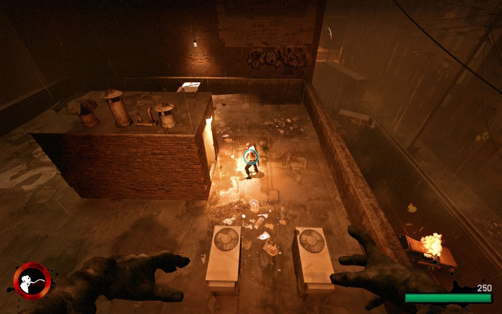
The default colors for the health status bars and silhouettes aren’t easily visible to color blind people. As an infected I am nearly unable to see a survivor with medium (hp>15<=50) health through brick walls (“cl_colorblind 0” or “cl_colorblind 1”):

A survivor with low (hp<=15) is, for all intents and purposes, invisible to me through brick walls (“cl_colorblind 0” or “cl_colorblind 1”):

However, as soon as I set the color blind mode to its third option (accomplished through the console with “cl_colorblind 2”) the survivors pop right out of their blending into the wall. First medium health, then low health:


The low health is especially of note because I am able to immediately discern that the person highlighted such is an excellent weak target. The colors chosen with color blind mode disabled are difficult to discern on their own even when not seen through walls. First, a survivor with medium health outlined, and then a survivor with low health outlined. Both with color blind mode disabled (“cl_colorblind 0”):


Once we enable the third color blind mode I am again able to be useful to my team because I too can pickup on the visual cues. First a survivor with medium health. Then a survivor with low health, both with color blind mode on its third setting (“cl_colorblind 2”):


As a survivor the color difference for low health has a huge impact on my ability to spot the status of myself and my teammates. First, a screenshot of a survivor’s health at 14 with color blind mode on the second setting (which only effects the crosshair) (“cl_colorblind 1”):

The red doesn’t pop out at me and it’s very easy for me to not notice it. Here’s the same shot with color blind mode on the third setting (“cl_colorblind 2”):

With color blind mode on the third setting, the new color, some blue green variant, is of high enough contrast that it actually draws my eye to it as soon as it changes.
The same goes for bleeding survivors. First, no color blind mode, next, third color blind mode:


I hope that more developers put color blind compatibility modes, or even design to accomodate, as it doesn’t require changing an entire game, into their schedules in the future. I, as one of those “infected”, will very much appreciate it. If you have any comments or know of more games that seem to have put thought into accessibility for color blind gamers, please do share below.
Pingback: A questão do daltonismo em gamedev | GamedevBR()
Pingback: links for 2009-01-14 | /dev/random()
Pingback: links for 2009-01-14 « Mike’s Blog()
Pingback: Color blind gamer()
Pingback: Colour Blindness And Videogames – A Gamer’s Perspective - The Average Gamer()
Pingback: Colour Blindness And Videogames � A Gamer’s Perspective – The … « Info Jugaad()
Pingback: A questão do daltonismo em gamedev | Select Game()